In the early 18th century, Tokyo became the largest city on the planet. Since then, Japan has been a country of urban sprawl, with an exaggerated scarcity of space, time and resources. In consequence, and long before the advent of Marie Kondo, clutter has defined its aesthetics.
This clutter dominates impressions of Japan’s town and cityscapes. Much of it is visible: heavy electricity cables rope their way down every street, and no eye can avoid the endless roadside signs flashing out to warn, to advise, to advertise.
But it is also audible: the air is dense with the cries of street hawkers and political vans, and even the traffic lights chirp when green. Interiors are no less cluttered: shops are packed tight with goods, the aisles covered in stickers recommending products, while instore speakers remind customers of a current campaign at full volume.
Japanese media only amplifies this sensation of excess. One might expect the fast, loud and brash TV adverts, but the programming is also gaudy and noisy. Trivia shows are stacked with rows of shouting celebrities, and screens swell with colourful text that blazes out over those speaking. Even highbrow newspapers seem crammed with text to the very edges, sparing only a thin line between one article and the next.
Zen-like minimalism
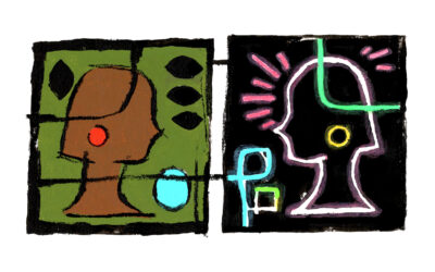
And yet there is a dichotomy in the aesthetic response to this lived environment, as products and brands seek to cut through the clutter. There is an extreme conflict between absence and presence, giving rise to two different Japans: one of the hyper-stylised bold imagery associated with kawaii culture that rarely makes it into the West, and one of zen-like minimalism typified by companies that find an international home much more easily, such as Muji.
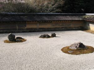

Minimalism is perhaps the easier of these to comprehend: it acts as a respite, a paradoxical celebration of the abundance of rarity. It can be a single object within an empty white space, or even a simple advert whose very quietness demands focus.
Managing the clutter
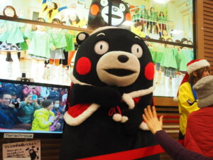
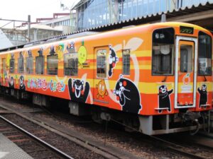
And yet its diametric opposite – Japan’s graphic culture – also seeks to distract from, to manage the clutter. It grabs attention through a contextual shorthand, full of tropes and symbolism that the brain can quickly make sense of. Mascot characters stand out in their stylistic simplicity, such as the apple-cheeked black bear Kumamon from Kumamoto prefecture, their cute expressions triggering a visceral, quasi-maternal response.
Does this make us, the audience, infants? Not at all: this is a semiotic shorthand of great richness and sophistication that permeates all aspects of life. Brands respond with packaging is that is either brash and plastered with icons, characters and text, or conversely of extreme purity and simplicity.
It is interesting to contemplate whether Japan – a world leader in technology, and the first nation to find solutions for an ageing population and a rich but stagnant economy – is once again showing us a glimpse of our future, as we each seek a refuge amidst cityscapes that seem to condense even as they inexorably grow.